Color is the easiest way to change how a space feels. It’s not just about picking colors you like — it’s about understanding how they interact with light, space, and the people living there. In feng shui, color carries energy. In modern design, it’s psychology. Both matter.
Whether you’re redesigning a bedroom, refreshing your kitchen, or completely reimagining your living room, color choices set the foundation. Get it right, and your space feels balanced and inviting. Get it wrong, and even great furniture won’t fix the underlying discord.
Understanding Color Families
Colors don’t work in isolation. They live in families — warm, cool, and neutral. Warm colors (reds, oranges, yellows) activate energy and create intimacy. They’re great for kitchens and dining areas where you want conversation and movement.
Cool colors (blues, greens, purples) calm the mind and expand space visually. Bedrooms and home offices thrive with cool palettes. Neutral colors (grays, beiges, whites) act as the bridge. They don’t compete — they support.
The key isn’t choosing one family. It’s layering them. A bedroom might start with soft blue walls, add warm wood tones, and finish with gray textiles. That’s balance.

Pro Tip: In small Sha Tin apartments, light colors on walls create perceived space. But dark colors work if you have enough natural light — they add sophistication without feeling cramped.
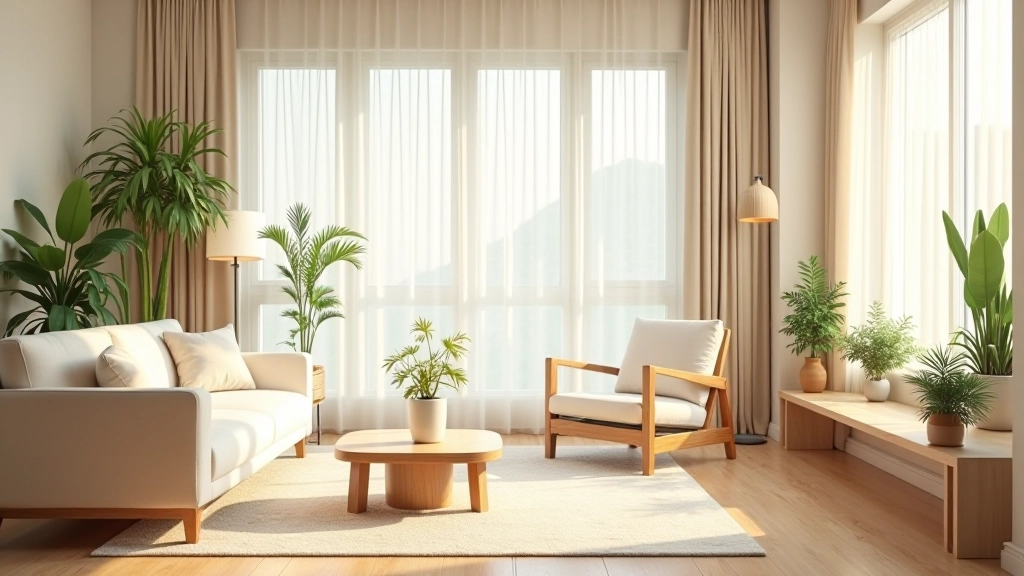
Room-by-Room Color Strategy
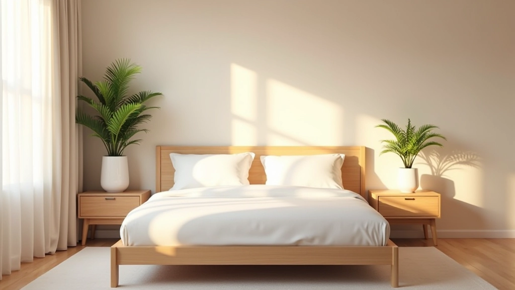
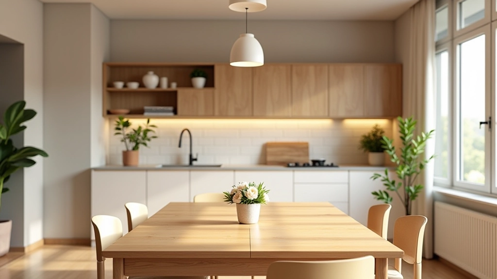
Different rooms have different jobs. Your bedroom isn’t your living room. Color should support what happens there.
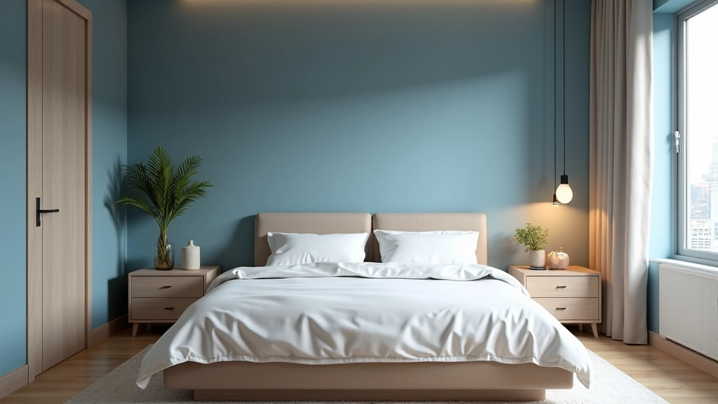
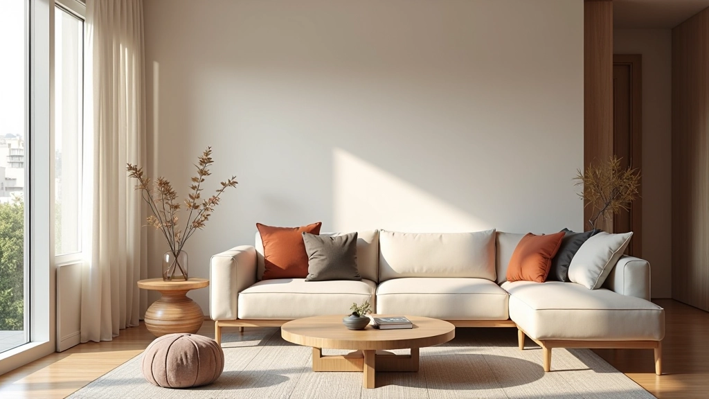
Bedrooms: You’re sleeping, resting, connecting with a partner. Soft blues, greens, or warm neutrals work best. Avoid bright reds or intense oranges unless you’re using them as accents only. Aim for 70% calm base color, 30% warmth through wood and textiles.
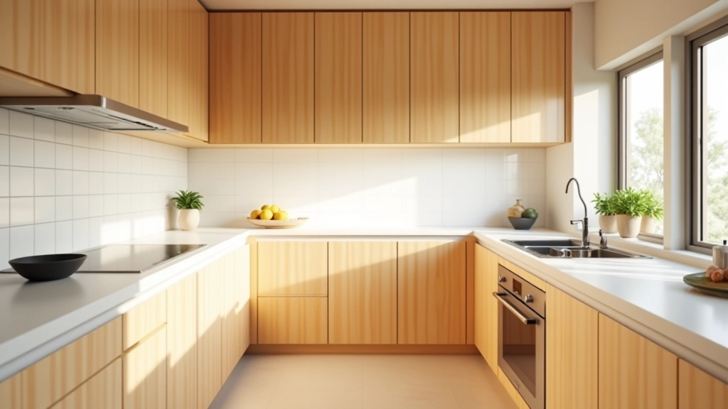
Kitchens: This is where activity happens. Warm tones energize. Creams, soft yellows, warm grays keep it inviting. Pair with natural wood or stainless steel to prevent it feeling too bright.
Living Areas: These spaces need flexibility. Neutral base colors allow your furniture and art to be the stars. Bring in color through accent pieces you can change seasonally.
Educational Note: This article provides general design guidance based on color theory and feng shui principles. Individual preferences, cultural backgrounds, and lighting conditions vary significantly. Test colors in your space before committing — paint samples under your actual lighting conditions, not just store samples. What works for one apartment won’t necessarily work for another, even in the same building.
The 60-30-10 Rule in Practice
Interior designers use a formula that works: 60% dominant color, 30% secondary color, 10% accent. This isn’t rigid, but it’s a starting point that prevents chaos.
In a Hong Kong apartment, this might look like: 60% soft gray walls, 30% warm wood tones and beige furniture, 10% accent color (maybe a deep teal or warm mustard) through pillows, art, and a rug. It’s balanced without being boring.
The 10% accent is where personality lives. Don’t be afraid of it. A single accent wall in a deeper shade, or colorful artwork, or even just a statement chair — that’s what makes a space feel intentional rather than generic.
Light and Color: They’re Inseparable
Here’s what most people miss: color doesn’t exist without light. The most beautiful paint color looks completely different at 9 AM versus 3 PM. Hong Kong apartments often have limited light exposure — north-facing rooms stay cooler, south-facing spaces get intense afternoon sun.
Cool colors can feel cold in a dark apartment. Warm colors can feel overwhelming in a bright one. Before choosing color, observe your light patterns for a full day. Notice where shadows fall. That’s your actual canvas.
In rooms without much natural light, warmer neutrals or soft greens prevent the space from feeling cave-like. In bright spaces, you can pull off deeper, more saturated colors without them feeling heavy.
Start Small, Test First
Don’t paint your entire bedroom based on a color swatch you like at the hardware store. Buy sample pots. Paint large patches on your walls. Live with them for a few days under different lighting. It seems like extra work, but it’s the cheapest insurance against a color choice you’ll regret.
Color theory isn’t complicated once you understand the basics: families work together, rooms have different needs, and light changes everything. Use that knowledge. Trust your instincts. And remember — color can always be changed. It’s the most forgiving design decision you’ll make.
Ready to explore more design principles? Check out our guides on feng shui fundamentals and the five elements to deepen your understanding of harmonious spaces.